Optional affiliationTo override default affiliationColors, provide colors as a map. Only the affiliation values for which you provide a color will override the default color.
{@link AffiliationColorMap AffiliationColorMap}.
Optional affiliationTo remove the affiliation color for an icon.
true
2022.0
Optional bloomTo define a style, which is picked up on WebGL maps only. Default value: undefined
2022.1
Optional bodyIf you want to render a tactical graphic completely accurately, using complex strokes and decorations. Possible disadvantage: on a webGL map, fully rendering the tactical graphic means that a shader needs to be compiled, which might lead to a delay in rendering. For more information, see performance boosters on a webGL map. If both body and skeleton are set to false, a warning is issued and body is overriden with true.
true
2022.0.03
Optional colorTo customise the line-color for unframed icon symbols, line symbols, off-set lines of icon symbols and for movement direction arrows. Default value: white "#FFFFFF"
2023.0
Optional cornerTo get rounded corners on lines of tactical graphics, with a value between 0 (no rounding) and 1 (fully rounded). Applied only when allowed. Tactical graphics that are supposed to have sharp edges will not get rounded.
0
2021.0
Optional drapeWhether you want your military symbols to be draped on top of the terrain or a 3D tiles mesh (or both).
This setting is only relevant for 3D maps and is ignored for 2D maps.
a shape is only draped (on {@link DrapeTarget.TERRAIN terrain}) if it has undefined or zero Z.
2022.1
Optional drapedWhether you want your military symbols to be draped on top of the terrain or not.
This property only exists for backwards compatibility. You should use drapeTarget instead.
false is equivalent to DrapeTarget.NOT_DRAPED and true is equivalent to
DrapeTarget.TERRAIN.
This setting is only relevant for 3D maps and is ignored for 2D maps.
a shape is only draped (on {@link DrapeTarget.TERRAIN terrain}) if it has undefined or zero Z.
Use drapeTarget instead.
Optional haloTo define the color of a halo, for increased visibility of your symbols (both icons and tactical graphics). Only if both the width and the color get a value different from the default, a halo will be drawn.
white
2021.0
Optional haloTo define the width (in pixels) of a halo, for increased visibility of your symbols (both icons and tactical graphics). Only if both the color and the width get a value different from the default, a halo will be drawn.
1
2021.0
Optional iconDefines the size (in pixels) of the icon (width and height).
64
Optional labelSets the relative position of the label with respect to the object. Only used for freeform polygon-shaped tactical graphics without a predefined position.
"center"
2023.0
Optional labelBy default, labels are decluttered. Set this to "NON_DECLUTTERED" to stop decluttering labels. See also: LabelStyle.group Default value: undefined
2022.0.03
Optional lineTo customize the width of the lines in tactical graphics.
2
Optional maxThe length of the movement direction arrow is, by default, between 1 (min) and 10 (max) times the defined iconSize. This parameter allows you to redefine the max ratio. The length in pixels of your speed leader is calculated as speed(m/s)xspeedLeaderLengthRatioxiconSize and is clipped between 1xiconSize and maxRatioMovementDirectionArrowxiconSize.
10
2022.0
Optional rectangleIf you want to add a rectangle around your icon, you can use this in your selection style. When you use it as a selection style, it will be colored using the selection color.
true for {@link PaintState.selected paintState selected}.
2022.0.03
Optional selectionDefines the color used for the selection rectangle displayed when an icon is selected. Defines the color used for the tactical graphic styled as body or skeleton when a symbol gets selected.
"#FF9900"
Optional skeletonIf you want to render a tactical graphic in a simplified style, using simple lines and no decorations. Possible usage:
false
2022.0.03
Optional speedThe ratio of the speed leader to the symbol size against the speed value of 1m/s. The length in pixels of your speed leader is calculated as speed(m/s)xspeedLeaderLengthRatioxiconSize and is clipped between 1xiconSize and maxRatioMovementDirectionArrowxiconSize.
0.05
2022.0.05
Optional symbolTo remove the fill of an icon (the frame takes over the affiliationColor).
true
2022.0
Optional symbolTo only partially fill the icon, value between 0 (no fill) and 1 (fully filled).
1
2022.0
Optional symbolTo disable the frame of an icon. Default value: true
2022.0
Optional symbolTo disable the symbol inside an icon.
true
2022.0
You can provide styling properties for your military symbology icons and tactical graphics through the style option of your constructor options. Styling properties can depend on feature or paintState.
For icons, there are some basic style properties: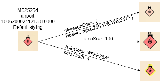
There is also a set of more advanced icon style properties: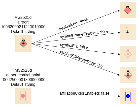
Some style properties are specific to tactical graphics: