Class TLspNavigationControlsBuilder
java.lang.Object
com.luciad.view.lightspeed.swing.navigationcontrols.TLspNavigationControlsBuilder
Builder for creating navigation control components that interacts with a view
(ILspView).

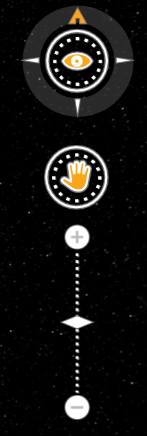
The navigation control component is composed out of different elements (from top to bottom):
- The compass navigation control: the outer ring allows to change the rotation of the map, and the inner part allows to change the tilt the camera.
- The pan navigation control: allows to pan the map around
- The zoom control: allows to zoom in and out
Creating a navigation control component including all widgets can be done as follows:
    //Create the navigation controls
    //In this example, we use all available types of navigation controls
    Component navigationControls = TLspNavigationControlsBuilder.newBuilder(view)
                                                                .allNavigationControls()
                                                                .build();
ILspAWTView:
    //Add the navigation controls in the overlay panel of the view
    //This ensures that they are placed on top of the map
    view.getOverlayComponent().add(navigationControls, TLcdOverlayLayout.Location.NORTH_EAST);
- Change the images by specifying the image path.
- Only include a subset of widgets by using the
*NavigationControl()method instead of theallNavigationControls()method.
- Since:
- 2012.0
-
Constructor Summary
ConstructorsModifierConstructorDescriptionprotectedCreates aTLspNavigationControlsBuilderwith default initialization. -
Method Summary
Modifier and TypeMethodDescriptionSets a compass, pan and zoom component on the navigation controls.Sets an altitude exaggeration component on the navigation controls to exaggerate the terrain in the view.altitudeExaggerationToolTip(String aAltitudeToolTip) Sets the tooltip text for the altitude exaggeration tool.alwaysActive(boolean aIsAlwaysActive) Sets whether or not the navigation controls always appear active.build()Builds a Component that contains controls to navigate the given view.Sets a compass and pan component on the navigation controls to rotate and pan the view.Sets a compass component on the navigation controls that can change the rotation of the view.compassRingToolTip(String aCompassRingToolTip) Sets the tooltip text for the compass ring tool.compassToolTip(String aCompassToolTip) Sets the tooltip text for the compass tool.compassUpArrowToolTip(String aCompassUpArrowToolTip) Sets the tooltip text for the compass up arrow tool.Sets the path to the images used to alter the appearance of the compass, pan and navigation components.Sets the image path to a path containing a default set of large images.magneticNorthMap(ILcdMagneticNorthMap aMagneticNorthMap) Lets the compass point to the magnetic north instead of true north, using the given magnetic north map.newBuilder(ILspView aView) Returns a builder to create navigation controls for the passed view.Sets a pan component on the navigation controls to pan the view.panToolTip(String aPanToolTip) Sets the tooltip text for the pan tool.Sets the image path to a path containing a default set of small images.Sets the view that will interact with the navigation controls.Sets a zoom component on the navigation controls to zoom in/out on the view.zoomToolTip(String aZoomToolTip) Sets the tooltip text for the zoom tool.
-
Constructor Details
-
TLspNavigationControlsBuilder
Creates aTLspNavigationControlsBuilderwith default initialization.- Parameters:
aView- the view that will interact with the navigation controls.- See Also:
-
-
Method Details
-
newBuilder
Returns a builder to create navigation controls for the passed view. By default:- Parameters:
aView- the view that will interact with the navigation controls.- Returns:
- a
TLspNavigationControlsBuilder
-
view
Sets the view that will interact with the navigation controls. Note that a view must be set before navigation controls can be build with this builder.- Parameters:
aView- the view that will interact with the navigation controls.- Returns:
- this builder.
-
altitudeExaggerationControl
Sets an altitude exaggeration component on the navigation controls to exaggerate the terrain in the view.- Returns:
- this builder
-
imagePath
Sets the path to the images used to alter the appearance of the compass, pan and navigation components. It is assumed that this folder contains a subfolder /compass, a subfolder /pan and a subfolder /zoom. The images in these folders must follow the naming conventions (seeALcdCompassNavigationControl,ALcdPanNavigationControlandALcdZoomNavigationControl). The default image path is currently based on theTLcdIconFactory.getDefaultTheme()andTLcdIconFactory.getDefaultSize(), but this might change in future releases.- Parameters:
aImagePath- the path to the images.- Returns:
- this builder.
-
smallImagePath
Sets the image path to a path containing a default set of small images.- Returns:
- this builder.
-
largeImagePath
Sets the image path to a path containing a default set of large images.- Returns:
- this builder.
-
alwaysActive
Sets whether or not the navigation controls always appear active. When this is false, the components will switch to their inactive appearance whenever the mouse is not hovering over them. The default value is false.- Parameters:
aIsAlwaysActive- a boolean that indicates whether or not the navigation controls always appear active.- Returns:
- this builder.
-
compassToolTip
Sets the tooltip text for the compass tool. The default is null, meaning that the compass tool will have no tool-tip text.- Parameters:
aCompassToolTip- aStringwhich will be used as a tool-tip text for the compass tool.- Returns:
- this builder.
-
compassRingToolTip
Sets the tooltip text for the compass ring tool. The default is null, meaning that the compass ring tool will have no tool-tip text.- Parameters:
aCompassRingToolTip- aStringwhich will be used as a tool-tip text for the compass ring tool.- Returns:
- this builder.
-
compassUpArrowToolTip
Sets the tooltip text for the compass up arrow tool. The default is null, meaning that the compass up arrow tool will have no tool-tip text.- Parameters:
aCompassUpArrowToolTip- aStringwhich will be used as a tool-tip text for the compass up arrow tool.- Returns:
- this builder.
-
panToolTip
Sets the tooltip text for the pan tool. The default is null, meaning that the pan tool will have no tool-tip text.- Parameters:
aPanToolTip- aStringwhich will be used as a tool-tip text for the pan tool.- Returns:
- this builder.
-
zoomToolTip
Sets the tooltip text for the zoom tool. The default is null, meaning that the zoom tool will have no tool-tip text.- Parameters:
aZoomToolTip- aStringwhich will be used as a tool-tip text for the zoom tool.- Returns:
- this builder.
-
altitudeExaggerationToolTip
Sets the tooltip text for the altitude exaggeration tool. The default is null, meaning that the altitude exaggeration tool will have no tool-tip text.- Parameters:
aAltitudeToolTip- aStringwhich will be used as the tool-tip text for the altitude exaggeration tool.- Returns:
- this builder
-
magneticNorthMap
Lets the compass point to the magnetic north instead of true north, using the given magnetic north map.- Parameters:
aMagneticNorthMap- the map to use. If null or not called, the compass will point to the true north.
-
build
Builds a Component that contains controls to navigate the given view. Note that at least the view that will interact with the navigation controls must be set before navigation controls can be build. If no navigation control has been added, thedefault controlsare added.
 Note: this method does not add the Navigation controls on top of the view.
To add this component to a (heavyweight)
 ILspView, seeILspAWTView.getOverlayComponent().- Returns:
- the Component that contains controls to navigate the given view.
-