Interface ImageIconStyle
Hierarchy
- GenericIconStyle
- ImageIconStyle
Properties
Optional anchorX
The x coordinate of the anchor for this icon. This can be either percentage or pixels. Example: "16px", or "50%". The default is "50%", which implies that the anchor-point is at the center of the image.
The anchor is always defined with respect to the original image size. This means that a scaled image will automatically have its anchor-point scaled.
The horizontal anchorpoint is always defined from left to right. { anchorX:"0px" } is the left of the image, and positive values
are points to the right.
The anchor point must be within the bounds of the original image size.
By default "50%"
Optional anchorY
The y coordinate of the anchor for this icon. This can be either percentage or pixels. Example: "16px", or "50%". The default is "50%", which implies that the anchor-point is at the center of the image.
The anchor is always defined with respect to the original image size. This means that a scaled image will automatically have its anchor-point scaled.
The vertical anchorpoint is always defined from top to bottom. { anchorY:"0px" } is the top of the image, and positive values
are points to the bottom.
The anchor point must be within the bounds of the original image size.
By default "50%"
Optional bloom
Adds a BloomEffect to the icon.
Bloom is only supported on WebGL maps.
Since
2022.1
Optional drape
The drape target of this icon.
Indicates if this shape should be draped on terrain, 3D Tiles meshes, not at all.
If draped or drapeTarget is not specified and the shape has zero Z, it will be draped on terrain.
If it has non-zero Z, it will not be draped.
This setting is only relevant for 3D geospatial maps. For 2D maps and 3D cartesian maps, this setting is ignored and DrapeTarget.NOT_DRAPED is used.
Optional draped
Whether this icon should be draped on terrain, or not be draped at all.
This property only exists for backwards compatibility. You should use drapeTarget instead.
false is equivalent to DrapeTarget.NOT_DRAPED and true is equivalent to
DrapeTarget.TERRAIN.
This setting is only relevant for 3D geospatial maps. For 2D maps and 3D cartesian maps, this setting is ignored and DrapeTarget.NOT_DRAPED is used.
Optional heading
The heading of the icon, defined as an azimuth: the clockwise angle from the north direction, in degrees
(range [0, 360[). A heading of 0 means the icon will always be pointing towards the north pole.
A value of 90 will make the icon always point towards the east, etc.
A heading that is not a Number or Number.NaN, is ignored.
The heading property can be used together with rotation. The rotation can be used to 'correct' a left-pointing arrow icon image, to make it point upwards (by setting a rotation of 90). Then, using a heading of 0 makes the arrow icon always point towards the north pole.
By default Number.NaN
Optional height
The target height of the image, with a given unit of measure.
This can be either percentage, pixels or a length unit. For example: "16px", "50%" or "25.2m". Valid length units are uoms registered in LuciadRIA. The default is "100%", which implies that the icon is painted at its original resolution.
If this is a number, the height is interpreted in the units defined by uom. If no uom is set, the height is interpreted in pixels.
You cannot mix world lengths and pixels for height and width. If height is expressed in a length unit, width must be as well (and vice-versa).
image
An Image or Canvas DOM element.
This image should either be a raster image, like a .png or .jpeg file, or be an image in SVG format.
Optional modulation
The color that is modulated with the icon. For example using an icon with gray-scale colors and a red modulation color will result in a resulting painted icon with red hues.
By default "rgba(255,255,255,1)"
Since
2022.0
Optional occlusion
When this icon should be painted in 3D in relation to other 3D data.
Notes:
- Mode OcclusionMode.VISIBLE_ONLY shows only the part of the icon that is not obscured by other 3D data. This is the default.
- Mode OcclusionMode.ALWAYS_VISIBLE shows the entire icon even if behind by other 3D data. The icon will appear in front of other objects.
- Mode OcclusionMode.OCCLUDED_ONLY shows only the part of the icon that is behind other 3D data. You typically use this to display obscured icons in combination with another style that uses "VISIBLE" mode.
- This parameter is only relevant in 3D.
- This parameter is only applied on non-draped icons.
By default OcclusionMode.VISIBLE_ONLY
Since
2020.0
Optional offsetX
The X offset that should be applied with respect to the screen location of the point. Positive values offset the icon to the right on the screen, negative values offset it to the left.
This offset is applied after rotation and does not take into account any scaling performed on the image. In other words, scaling and rotation are applied first. Then, this offset is applied as a post-effect.
If this is a number, its value is interpreted in the units defined by uom, which defaults to Pixels. If this is a string, its value is interpreted in the units defined in the string (e.g. meters for "25m" or pixels for "25px").
You cannot mix world lengths and pixels for offsetX and offsetY. If offsetX is expressed in a length unit, offsetY must be as well (and vice-versa).
Examples: "16px", "-25.2m". The default value is 0 (no offset, the icon is painted at its anchor point).
Optional offsetY
The Y offset that should be applied with respect to the screen location of the point. Positive values offset the icon to the bottom on the screen, negative values offset it to the top.
This offset is applied after rotation and does not take into account any scaling performed on the image. In other words, scaling and rotation are applied first. Then, this offset is applied as a post-effect.
If this is a number, its value is interpreted in the units defined by uom, which defaults to Pixels. If this is a string, its value is interpreted in the units defined in the string (e.g. meters for "25m" or pixels for "25px").
You cannot mix world lengths and pixels for offsetY and offsetX. If offsetY is expressed in a length unit, offsetX must be as well (and vice-versa).
Examples: "16px", "-25.2m". The default value is 0 (no offset, the icon is painted at its anchor point).
Optional opacity
The opacity of the icon, determines how transparent an icon will be painted. It's a numeric value and needs to be specified between 0 and 1. 0 indicates that the icon will be painted completely transparent and 1 indicates that the original opacity of the icon will be used.
By default 1
Optional rotation
The rotation of the icon, specified in degrees. The default is 0, which implies no rotation to the original icon. Rotations are applied in a clock-wise fashion. Rotation of the icon happens around its anchor-point.
By default 0
Optional stem
The line-style of a line which connects the border with the position of the feature on the map, using a perpendicular line.
Note that stem is not supported on a WebGL map.
Optional uom
Determines the interpretation of units for width, height offsetX and offsetY. When set to a length unit of measure (meters, feet,...), icons will grow and shrink as you zoom the map in and out.
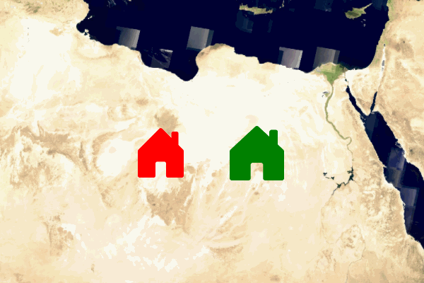
|
Pixel sized icon (red) vs. icon with a uom in meters (green).
The red icon always has the same size on screen. The green icon grows and shrinks as the map
is zoomed in and out.
|
For georeferenced maps, supported UnitOfMeasures are:
getUnitOfMeasure("Pixels")UnitOfMeasure of type getQuantityKind("Length"), for example getUnitOfMeasure("Meter")
The unit of measure applies to the width, height,
offsetX and offsetY.
The uom determines the interpretation of the values as pixels or as a length unit that represents
the actual size of real-world objects, like for example meter of foot.
The uom property is only supported on geographically referenced maps.
Maps configured with a cartesian reference do
not support IconStyles with a uom set.
The property is optional and the default value is the Pixel unit.
Example of a icon style with a size expressed in meters:
const RED_SQUARE_ICON_URL = "data:image/png;base64,iVBORw0KGgoAAAANSUhEUgAAAAgAAAAICAYAAADED76LAAAAH0lEQVQYV2P8DwQMeAAjSEEdIyNWJU1AvUNHAT5vAgDR8jHptuzwOwAAAABJRU5ErkJggg==";
geoCanvas.drawIcon(shape, {
url: RED_SQUARE_ICON_URL,
uom: getUnitOfMeasure("Meter"),
width: 40, // meters
height: 40 // meters
});
Note that you can also define a unit directly in a width or height string value:
geoCanvas.drawIcon(shape, {
url: RED_SQUARE_ICON_URL,
width: "40m",
height: "40m"
});
Since
2021.0
Optional width
The target width of the image, with a given unit of measure.
This can be either percentage, pixels or a length unit. For example: "16px", "50%" or "25.2m". Valid length units are uoms registered in LuciadRIA. The default is "100%", which implies that the icon is painted at its original resolution.
If this is a number, the width is interpreted in the units defined by uom. If no uom is set, the height is interpreted in pixels.
You cannot mix world lengths and pixels for width and height. If width is expressed in a length unit, height must be as well (and vice-versa).
Optional z
The Z-order of this shape. Shapes will be painted from lowest to highest Z-order, so that shapes with a higher Z-order are painted on top of shapes with a lower Z-order. The default value is 0.
By default 0
An icon style that uses an Image or Canvas DOM element.