LuciadRIA maps support hardware-accelerated density maps, often called heat maps. To show a density map of point cloud data, LuciadRIA counts the overlapping points on each pixel, and colors the pixels according to the amount of overlap.
To set up a density map, you enable the density property on the PointCloudStyle.
You must pass a ColorMap that maps the number of overlapping points to colors.
For example, with this color map, LuciadRIA paints pixels with 4 to 7 overlapping points green:
const densityColorMap = {
colorMap: createGradientColorMap([
{level: 2, color: "rgba(0, 0, 255, 1.0)"},
{level: 3, color: "rgba(0, 255, 255, 1.0)"},
{level: 4, color: "rgba(0, 255, 0, 1.0)"},
{level: 7, color: "rgba(255, 255, 0, 1.0)"},
{level: 9, color: "rgba(255, 0, 0, 1.0)"}
])
}
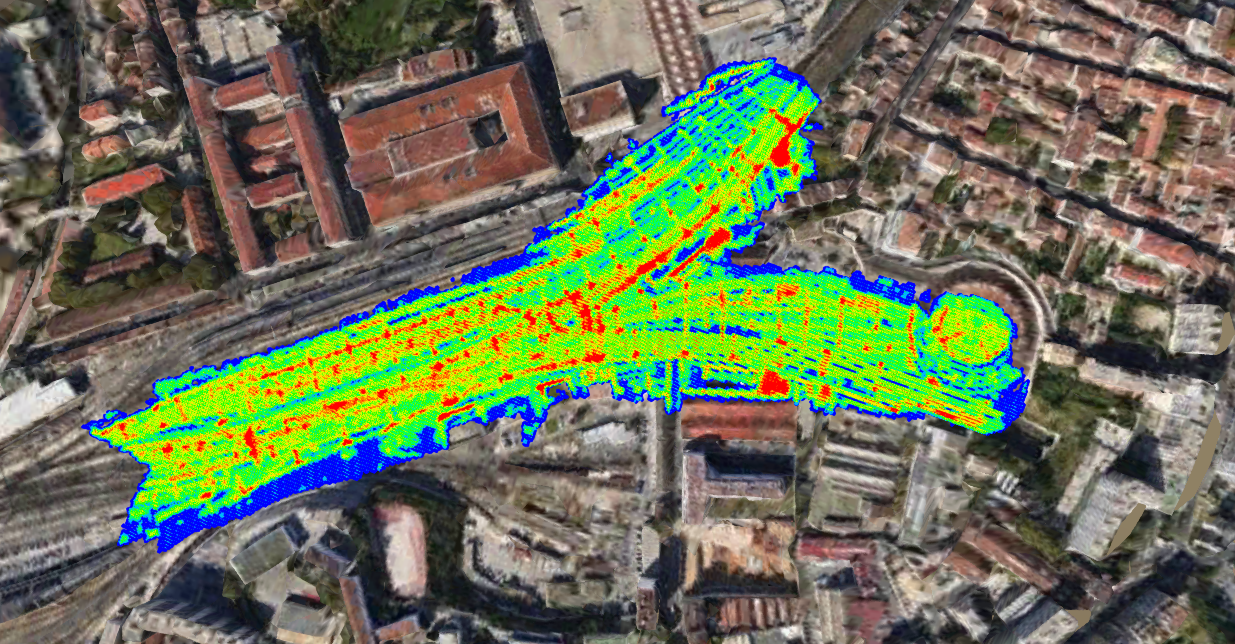
ogc3dTilesLayer.pointCloudStyle.density = densityColorMap;The color map results in this density map for the railway station in the marseille sample data set:
Changing the density map
There are several map and point cloud settings that have an effect on the visualization of your density map.
Change the map projection
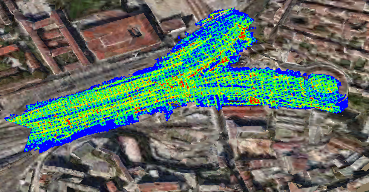
The projection impacts the density of your point cloud. If you change the map projection, the points in the point cloud align differently, affecting the point overlap per pixel.
For example, this figure shows the same top-down view of the railway station using a 2D projection.
Change the camera point of view
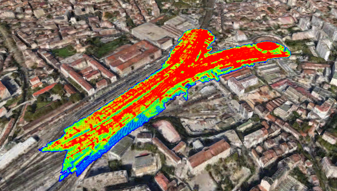
Projection is not the only parameter playing a role in the density painting of your data set. The camera configuration has a big impact on the result too. For example, it matters how close the map camera is to the data, or in what direction the camera is looking at the data in 3D. Different points of view result in different amounts of pixel overlap, and therefore in distinct density maps.
Here is the same data set using the same color map but this time from a different point of view. Observe how the point cloud seems more dense because more points overlap.
Change the point weight
Up until this section, the assumption was that all points had the same weight, and that only the number of points that overlap mattered. The weight of a point may vary too, though, resulting in a distinct density map visualization.
The alpha value of the point color determines the weight of the point.
This is typically a value between 0 and 1.
By default, all points of a completely opaque point cloud have a weight of 1.
You can change this weight value by changing the alpha value of the colors of your point cloud.
To do so, you can use a ColorExpression based on some attributes, for example.
Change the point size
Smaller or bigger points mean less or more overlap. Both the ScalingMode.PIXEL_SIZE and ScalingMode.ADAPTIVE_WORLD_SIZE are good settings for changing point size. ScalingMode.ADAPTIVE_WORLD_SIZE is the recommended setting because it offers the best results when users zoom in on the map. It preserves more detail than
the PIXEL_SIZE alternative.
|
Avoid using |
Change the quality settings
The quality settings you assigned to the data set also affect the density map.
Both the TileSet3DLayer.qualityFactor and TileSet3DLayer.performanceHints settings have an impact on the number of points loaded in the scene, and therefore on the number of overlapping points.
Use case : turn your building point cloud data into a floor plan
If you have point cloud data for a building, you can use LuciadRIA density painting to display a floor plan of that building.
If you look at the point cloud data of a building from above, you can expect the building walls to have a higher point density than the rest of the building. Therefore, it must be possible to visualize something resembling a floor plan of a building using density painting.
Define the color map
First, define a color map to make the points that aren’t part of a wall less visible.
Choose a transparent color for all areas with a lower density than the walls and a fully opaque color for the density level of the walls. This color map produces good results for an example data set:
colorMap: createGradientColorMap(
    [
      {level: 19, color: "rgba(255, 255, 255, 0.0)"},// levels [0,19] transparent
      {level: 20, color: "rgba(250, 255, 255, 1.0)"}// levels[20, infinity] opaque
])|
If you have several data sets, set up a color map for each data set, because different data sets might yield distinct results with the same color map. |
Set the quality
With a color map such as this one, it’s advisable to use a high quality setting like 4.0. To be able to zoom in on the floor map without generating too much noise, we limit the number of points to 8 million.
With the hard color map cut-off, you can be more lenient with your point constraints.
Result
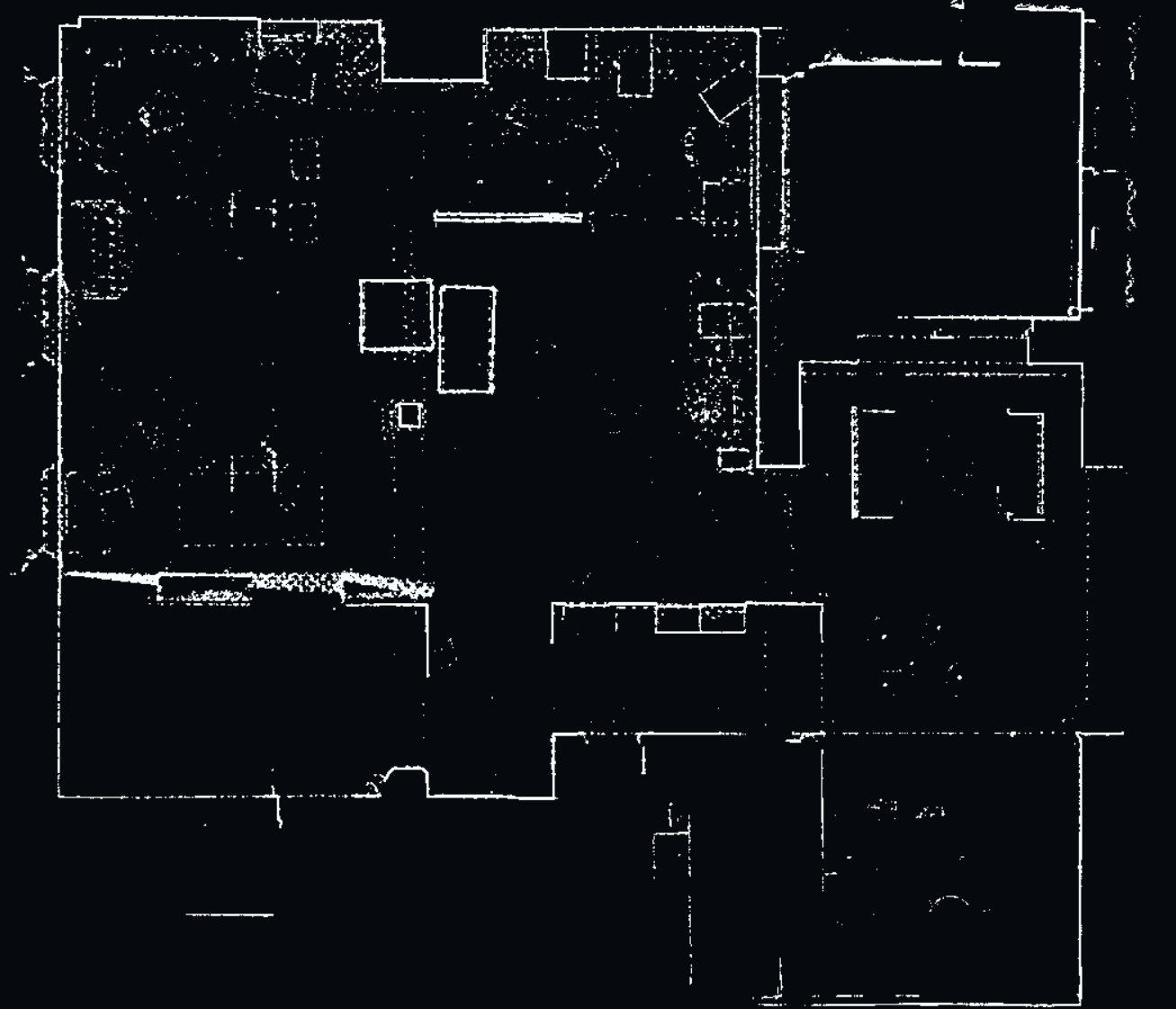
With this setup, the density map shows a good floor plan for the example data set.
This is an overview of the floor plan:
This is a zoomed-in view:
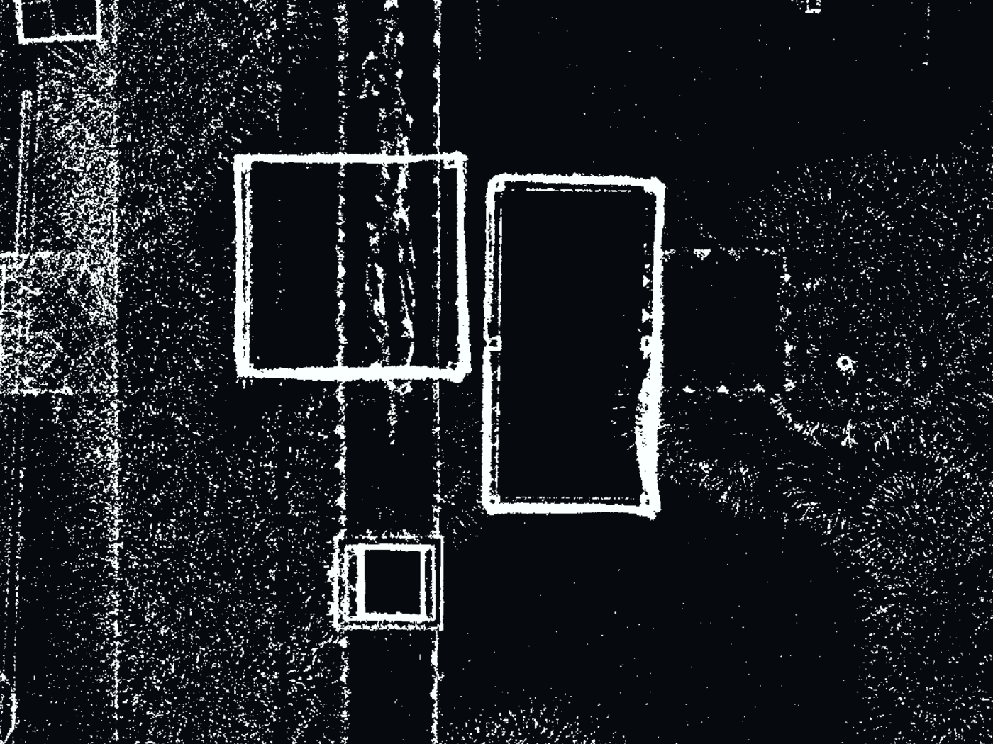
As you can see, there’s a good overview of the layout of the room with only a few artifacts.
Density map limitations
-
Only
PointCloudPointShape.DISCis supported. -
PointCloudStyle.gapFillsetting isn’t compatible with density painting. Any gap filling setting will be ignored if density is enabled. -
Densities are computed per layer.
-
The
PointCloudStyle.blendingsetting isn’t compatible with density, and will be ignored.
See the API documentation of PointCloudStyle for more details.