LuciadCPillar Samples
Browse samples per component: All installed
Highlighted samples
Gaussian splats
Video Projection
Panorama
Data Formats
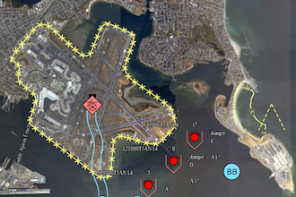
Military Symbology
OGC 3D Tiles
Gaussian splats
Video Projection
Panorama
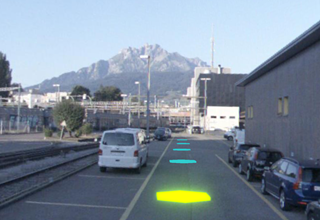
Data Formats
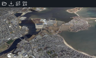
Military symbology
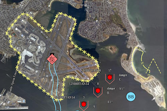
OGC 3D Tiles
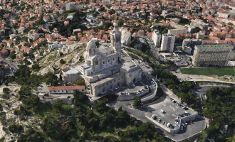
Gaussian splats
Video Projection
Panorama
Data Formats
Military Symbology
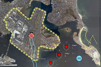
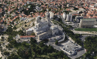
OGC 3D Tiles
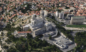
LuciadCPillar
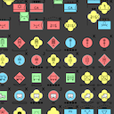
Military symbology: all symbols desktop_cpp_sample_all_symbols
This sample demonstrates all supported military icon symbols and tactical graphics.
The sample shows all military icons or tactical graphics for a specific symbology, with random modifier values. Icons and tactical graphics are labeled as prescribed by the military symbol standards.
Use the menu to switch between icons and tactical graphics or to change the symbology.
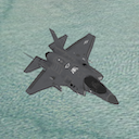
Camera desktop_cpp_sample_camera
This sample illustrates how to use the Camera API using a First-Person camera controller using user-input and an Orbit camera controller (also called Pole camera). You can switch between the controllers using the buttons in the toolbar above the map.
The First Person Camera Controller allows the control of the camera and modify its position using a predefined keymap to move and the mouse to change the camera's yaw and pitch.
The Orbit camera consists of a camera orbiting around a cube, keeping that point of interest in the center of the view. This controller uses the Map::IRendererCallback API to modify the camera on each repaint of the Map.
Complex Strokes desktop_cpp_sample_complexstrokes
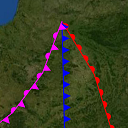
The Complex Strokes sample illustrates how to use the "Complex Stroke" API in LuciadCPillar. This is a powerful API that allows you to stroke lines with complex patterns and add decorations at specific locations along the line. For example, you could draw a line with a sawtooth pattern and decorate it with arrows at the start and the end of the line.
In the sample you will see various shapes and lines that are stroked using the Complex Stroke API, grouped into themes. You can see how the shape is styled in the sample code.
You can select an object to start editing it. Notice how the patterns dynamically follow the shape while editing.
The Cookbook Theme is intended for developers. You can experiment with complex stroke line styles by changing sample snippets, or by creating new complex stroke styles and visualizing the results. You can also edit shapes to check how the complex stroke line style is drawn over the vertices of a shape.
Data Formats desktop_cpp_sample_dataformats
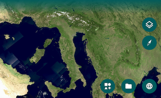
This sample demonstrates working with different data on the map. It starts with a map that has a Blue Marble background layer.
There is a toolbar that allows you to:
- Open supported files
- Connect to a web service (WMS, WMTS, WFS, LTS, OGC 3D tiles, HSPC, HERE Maps, and MBTiles)
- Add a basic vector model showing several supported geometries using default styling.
- Add a layer with dynamic data. The rendering of the dynamic data changes when you zoom in.
There is a layer control allowing you to change the visibility of layers and to re-order them.
Selecting a feature lists its properties in a panel below the layer control. Clicking a WMS or WMTS layer sends a GetFeatureInfo request, and the properties of the returned feature appear in the same panel.
The Mapbox style file referenced within the 'Connect to MBTiles' license file is available at: https://sampledata.luciad.com/data/mbtiles/osm_styles/osm-bright/LICENSE.md. The default MBTiles dataset of Belgium is provided by OpenStreetMap.
Editing and creation desktop_cpp_sample_editing
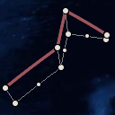
This sample demonstrates how to create and edit features using the edit API. It shows a map with several features.
Instructions
Creating features
Features can be added to the map using the button in the toolbar.
Polylines, polyline rings and bezier curves can be created using a click mode. Polylines and polyline rings can also be created with a free hand mode. In click mode, use double-click or touch long press to end creation. For bezier curves the creation ends when the last point is placed. In free hand mode, the feature is finalized as soon as the drag gesture ends.
Editing features
Click or touch a feature to select it and show its edit handles. Drag the edit handles around to change the geometry.
Points can be added at the beginning or the end of a polyline using the Shift modifier while clicking with the left mouse button.
Points can be removed from a polyline or polyline ring using Ctrl-click or touch long press.
Tutorial layers
This sample also includes a couple of layers that are used in tutorials in the product documentation:- Tutorial 1: the tutorial on how to customize an existing handles provider
- Tutorial 2: the tutorial on how to add extra handles to an existing handles provider
- Tutorial 3: the tutorial on how to create a custom handles provider
Feature Styling desktop_cpp_sample_feature_styling
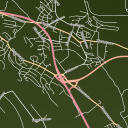
This sample demonstrates loading and styling of feature data.
It has a map with roads data:
- The type of roads that are loaded are configured per map scale.
- The styling of the data depends on their type and on the map scale.
Load some data on a map desktop_cpp_sample_firstapp
This sample demonstrates how to load data on a basic map using Qt Quick.
It has a map with following data:
- Bluemarble raster background
- Rivers in Switzerland
- Elevation data for Switzerland
Gaussian splats desktop_cpp_sample_gaussiansplats
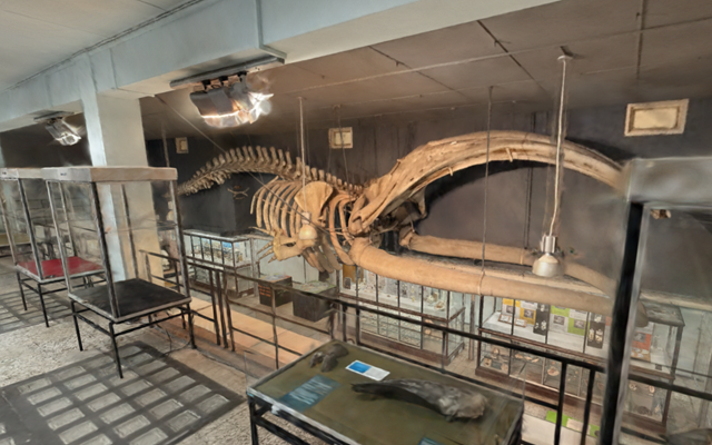
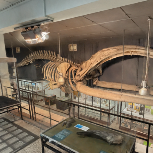
This sample shows how to load and visualize 3D Gaussian splatting data on the map, and how to inspect it from close
by. The data is delivered as an OGC 3D Tiles service and painted with a GaussianSplatsStyle, which
can be used to configure visual fidelity and performance.
Features
Dataset
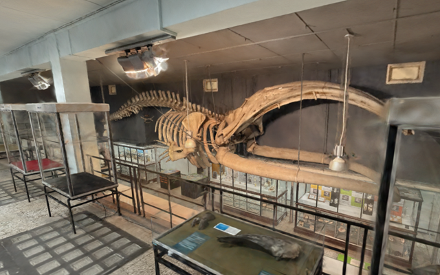
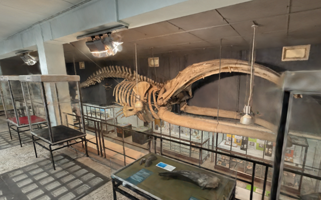
This is a Gaussian splatting dataset of the Museum of Zoology, maintained by the Catholic University of Leuven. The museum houses a collection of 5000 animals and skeletons, among which the skeleton of a bowhead whale (Balaena mysticetus) hanging from the ceiling. It was captured with permission of the university.
To load your own Gaussian splatting dataset in LuciadCPillar, see the Data Formats sample > Connect to service > OGC 3D Tiles.
Navigation
- Use the arrow keys or W/A/S/D to move horizontally, and Q/E to move down and up.
- Drag with the right mouse button to turn the camera.
- Hold Shift to move faster, or Space to move slower.
- On a touch screen, one finger turns the camera in place, two fingers pan, and pinching zooms.
- Select a point of interest in the Locations panel to fly towards it.
3D Data
Use Ogc3DTilesModelDecoder to create an ITileSet3DModel and use
TileSet3DLayer to create a layer for it. Pass a GaussianSplatsStyle to the layer builder to
decide how the splats are painted. This works for any OGC 3D Tiles tile set that contains SPZ, or glTF with SPZ
payloads.
Gaussian splatting data is often not georeferenced: the model then has a Cartesian reference and carries no
information about where on Earth it belongs. This sample recognizes that case and hands the model a
GeoLocation, which places it at a chosen location on the globe.
Gaussian Splat Settings
The Quality preset in the Options panel of the side bar, from Low to Ultra, balances
visual fidelity against rendering performance. Each preset combines a resolutionScale, an opacityCutoff and a
highPrecisionColors setting on the GaussianSplatsStyle of the splat layer, together with a
quality factor on the layer itself, which decides how much detail the tile set loads.
The style keeps enableDepth on, so the splats are taken into account when querying the depth at a pixel
and they can occlude other data such as meshes, point clouds and features. Querying the depth is also what lets the
navigation act on the splats themselves.
Labels desktop_cpp_sample_labels
This sample demonstrates how to use the label API and how to customize how the labels are displayed.
It has a map with states, rivers and cities data. Labels are decluttered to prevent label overlap and to avoid overlap with the view bounds.
Cities are filtered based on their population and become visible when you zoom in. The city labels contain more information when a city is selected and the used font size is derived from the population of the city. When a city's label can not be placed next to the city, a line (called pin) is drawn from the city location to its label. City labels are configured with a priority such that the labels of larger cities are shown in favor of labels of smaller cities when there is no room to display all labels.
Rivers only appear when the map is zoomed in enough and their labels are oriented based the on the river's direction.
States have labels which are positioned inside the state area. The state labels have lower priorities than city labels.
OGC 3D Tiles desktop_cpp_sample_ogc3dtiles
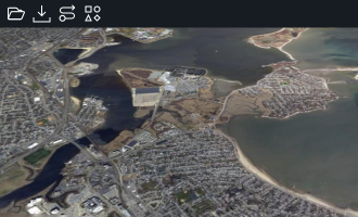
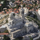
This sample shows how to load and visualize OGC 3D tiles meshes and point cloud data on the map. It also shows you how to style meshes and point clouds with expressions. The map supports both 3D and 2D projections.
Features
3D Data
Use Ogc3DTilesModelDecoder to create an ITileSet3DModel and use
TileSet3DLayer to create a layer for it. You can load 3D tileset data on 2D and 3D maps.
Graphics Effects
The Effects Settings tool shows the graphics effects that can be applied on a 3D scene:
- Eye-dome lighting (Depth Perception).
- Ambient occlusion (Ambient Light).
Expression based styling
TileSet3DLayer allows to set a PointCloudStyle that defines the expression based styles
for the point cloud data. This is demonstrated for the LIDAR layer that contains railways station point cloud data.
There are three types of expressions:
- The
colorExpressionproperty defines colors for point. By default colors are defined in the tile data. If no color is defined, LuciadCPillar paints them using a gray color. You can useStyleExpressionFactoryto define an expression that evaluates to a color value, e.g. based on attributes in the data. This sample shows how you can create a color expression based on the height of the points or on their intensity. - The
visibilityExpressionproperty is a filter that determines point cloud data visibility. You can useStyleExpressionFactoryto define an expression that evaluates to a boolean value. This sample shows how to filter points based on their height. - Point size expressions can be configured on the
PointCloudStylebuilder. You can useStyleExpressionFactoryto define an expression that evaluates to a double value, that is interpreted as pixels or meters. This sample adds a slider that can be used to choose a point size.
Data
The Marseille 3D mesh data used in this sample was created by Airbus with Airbus Street Factory. The train station
lidar data was created by Flying-Cam for Altametris and SNCF Réseau. Both datasets are available as OGC 3D Tiles
services, hosted by our LuciadFusion server on https://sampleservices.luciad.com/.
You can use these services only for simple tests and demonstrations. You should not rely on either of them in any
way.
Panorama desktop_cpp_sample_panorama
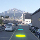
This sample illustrates how to use LuciadCPillar's Panorama API. A panorama is a photo with a very wide field of view, often even covering the full 360 degrees.
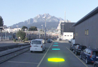
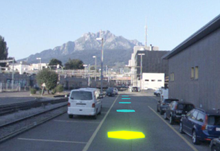
The map shows the Lucerne city mesh and a set of panorama locations along a track near the Lucerne train station. Each panorama location is visualized as a flat hexagon lying on the ground. Hovering a hexagon highlights it in green, clicking it selects it and highlights it in yellow.
Click a hexagon to fly the camera into that panorama and reveal its imagery. The map then switches to a look-around mode: drag to change the viewing direction and scroll to adjust the field of view. The camera eye stays pinned to the panorama location. When you are inside a panorama, click the "Leave Panorama" button at the top of the map, or press Escape, to switch back to the 3D map.
In the sample code, you will find a controller and animations you can reuse and adapt in your own projects.
PanoramaController keeps the camera eye pinned while you look around, and
PanoramaViewer flies the camera into a panorama and cross-fades the imagery when you move from
one panorama to another. The usage of the actual Panorama API can be found in
viewer/PanoramaViewer.cpp and model/PanoramaLocationModelFactory.cpp.
The data in this sample is provided by Hexagon GeoCloud.
Parameterized Styling desktop_cpp_sample_parameterized_styling
This sample shows how to display time-based data and expression-based styling.
Data
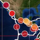
The sample shows an overview of world-wide earthquakes from 2000 to 2011, as well as the tectonic plates of the planet. Both are GeoPackage files that are styled and filtered using properties from the files.
The dot size indicates the earthquake's magnitude : larger dots for stronger quakes.
The dot color indicates the earthquake's depth : quakes near the surface are red, deeper quakes are yellow to blue.
The color of the fault lines depends on the type of fault lines: light yellow lines indicate subduction
fault lines, while light blue lines indicate non-subduction fault lines.
When the earthquakes layer is selected in the layer tree, two sliders can be used to apply filtering on the
earthquake data. One is a time range filter, and the other filters based on the magnitude of the earthquakes.
The filtering is done via the visibility expression on the IconsDrawCommand, by using parameter
expressions.
The sample also show countries with a fill color that is derived from the population property of each country. Country borders are highlighted in black.
When the country layer is selected in the layer tree, one slider can be used to filter countries based on a population range.
The filtering is done via the visibility of the GeometriesDrawCommand, by using parameter expressions.
Parameterized styling
With an IParameterizedFeaturePainter you can style your data using expressions that can be created
with the StyleExpressionFactory. In this sample, this is demonstrated in both the
EarthQuakePainter and the CountryPaintercode>. By using expressions, you can achieve
similar visualization as a traditional IFeaturePainter but also make use of fast filtering and dynamic
styling.
Using the CPillar map in Qt Widget desktop_cpp_sample_qt_widget
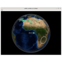
This sample demonstrates the integration of the map into the Qt framework using Qt Widgets.
It has a map with bluemarble as background data.
There is a menu action which allows to open supported files.
Controller customization for selection desktop_cpp_sample_selection
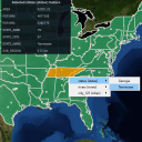
This sample demonstrates how to create and use the controller API in order to select the right feature.
It has a map with states, rivers and cities data:
- When a feature is selected, feature properties are listed in a panel.
- While pressing Alt and clicking on one or several features, a context menu allows the user to select which feature to select/unselect.
- While pressing Shift and dragging the mouse, a rectangle is drawn and selects/unselects all features under it. This feature is only available with a 2D map.
Military Symbology desktop_cpp_sample_symbology
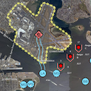
This sample demonstrates the modeling, visualization, editing and creation of military icons and tactical graphics, for the MS2525 and APP6 standards.
The sample starts up with a few tactical graphics and icons already initialized on a map. To create a new symbol, type its name in the toolbar widget, pick the desired symbol from the list and click on the map to start creation.
The sample also includes an MGRS grid, displaying labeled grid lines with increasing detail as the view zooms in. An overview label centered at the top of the map provides positional context with the currently visible MGRS grid zone and, if zoomed in enough, 100 km square.
Line-of-sight desktop_cpp_sample_terrain_analysis
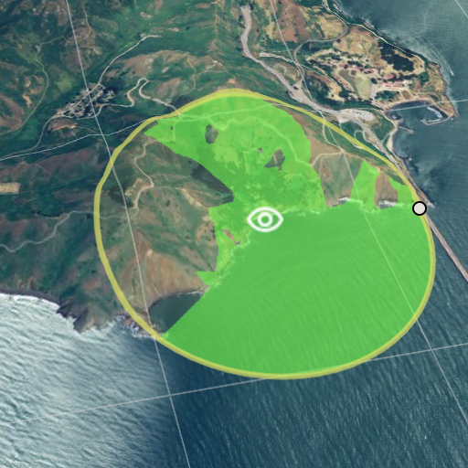
This sample demonstrates how LuciadCPillar supports visualizing and editing line-of-sight coverage data.
- An Elevation layer visualized as 3D terrain and used for the line-of-sight coverage computation
- An Editing layer allowing to create and edit new observers
- A Line of Sight layer allowing to visualize the line-of-sight coverage data
The first button at the top left of the toolbar allows to create new observers. Existing observers can be selected, moved and resized, using the handles. Selected observers can be removed either by pressing the backspace or delete key, or by clicking the second button on the toolbar. Selected observers can be deselected by pressing the escape key. Added observers are positioned 10 meters above the terrain. In this sample, the line-of-sight coverage is limited to a radius of at most 60 kilometers.
Tracks desktop_cpp_sample_tracks
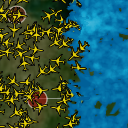
This sample demonstrates working with dynamic data on the map as well as using density styling to create heat maps.
It starts in normal mode, with airplanes flying between cities. The rendering of the dynamic data changes when you zoom in, including pin style labels.
Dynamic mode shows a heat map of the airplanes, made by applying density painting to icons. Static mode has density painting applied to lines between cities, with more trajectories between two cities resulting in brighter lines.
Video Projection desktop_cpp_sample_video_projection
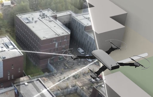
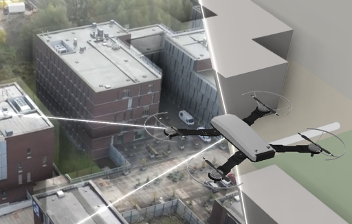
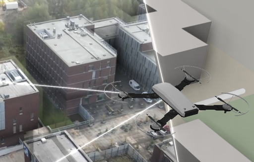
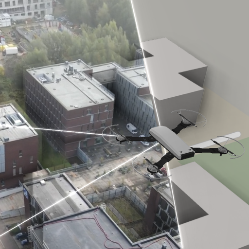
This sample demonstrates how to use the Projected Imagery API, which can be used to project and visualize drone or security camera footage.
Use the video panel controls on the left to control playback, or press the space bar to pause and resume. Each video frame is projected onto the map using the corresponding flight data.
The map's camera follows the drone by default. You can toggle this behavior with the camera lock button at the top.
The background layer using MbTiles is based on map data from OpenStreetMap.
The Mapbox style file referenced within the 'Connect to MBTiles' license file is available at: https://sampledata.luciad.com/data/mbtiles/osm_styles/osm-bright/LICENSE.md.
Military symbology: all symbols desktop_csharp_sample_all_symbols
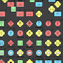
This sample demonstrates all supported military icon symbols and tactical graphics
The sample shows all military icons or tactical graphics for a specific symbology, with random modifier values. Icons and tactical graphics are labeled as prescribed by the military symbol standards.
Use the menu to switch between icons and tactical graphics or to change the symbology.
Camera desktop_csharp_sample_camera
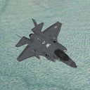
This sample illustrates how to use the Camera API using a First-Person camera controller using user-input and an Orbit camera controller (also called Pole camera). You can switch between the controllers using the buttons in the toolbar above the map.
The First Person Camera Controller allows the control of the camera and modify its position using a predefined keymap to move and the mouse to change the camera's yaw and pitch.
The Orbit camera consists of a camera orbiting around a cube, keeping that point of interest in the center of the view. This controller uses the Map.IRendererCallback API to modify the camera on each repaint of the Map.
Complex Strokes desktop_csharp_sample_complexstrokes
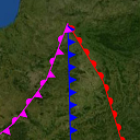
The Complex Strokes sample illustrates how to use the "Complex Stroke" API in LuciadCPillar. This is a powerful API that allows you to stroke lines with complex patterns and add decorations at specific locations along the line. For example, you could draw a line with a sawtooth pattern and decorate it with arrows at the start and the end of the line.
In the sample you will see various shapes and lines that are stroked using the Complex Stroke API, grouped into themes. You can see how the shape is styled in the sample code.
You can select an object to start editing it. Notice how the patterns dynamically follow the shape while editing.
The Cookbook Theme is intended for developers. You can experiment with complex stroke line styles by changing sample snippets, or by creating new complex stroke styles and visualizing the results. You can also edit shapes to check how the complex stroke line style is drawn over the vertices of a shape.
Data Formats desktop_csharp_sample_dataformats
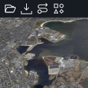
This sample demonstrates working with different data on the map. It starts with a map that has a Blue Marble background layer.
There is a toolbar that allows you to:
- Open supported files
- Connect to a web service (WMS, WMTS, WFS, LTS, OGC 3D tiles, HSPC, HERE Maps, and MBTiles)
- Add a basic vector model showing several supported geometries using default styling.
- Add a layer with dynamic data. The rendering of the dynamic data changes when you zoom in.
There is a layer control allowing you to change the visibility of layers and to re-order them.
Selecting a feature lists its properties in a panel below the layer control. Clicking a WMS or WMTS layer sends a GetFeatureInfo request, and the properties of the returned feature appear in the same panel.
The Mapbox style file referenced within the 'Connect to MBTiles' license file is available at: https://sampledata.luciad.com/data/mbtiles/osm_styles/osm-bright/LICENSE.md. The default MBTiles dataset of Belgium is provided by OpenStreetMap.
Editing and creation desktop_csharp_sample_editing
This sample demonstrates how to create and edit features using the edit API. It shows a map with several features.
Instructions
Creating features
Features can be added to the map using the button in the toolbar.
Polylines, polyline rings and bezier curves can be created using a click mode. Polylines and polyline rings can also be created with a free hand mode. In click mode, use double-click or touch long press to end creation. For bezier curves the creation ends when the last point is placed. In free hand mode, the feature is finalized as soon as the drag gesture ends.
Editing features
Click or touch a feature to select it and show its edit handles. Drag the edit handles around to change the geometry.
Points can be added at the beginning or the end of a polyline using the Shift modifier while clicking with the left mouse button.
Points can be removed from a polyline or polyline ring using Ctrl-click or touch long press.
Tutorial layers
This sample also includes a couple of layers that are used in tutorials in the product documentation:- Tutorial 1: the tutorial on how to customize an existing handles provider
- Tutorial 2: the tutorial on how to add extra handles to an existing handles provider
- Tutorial 3: the tutorial on how to create a custom handles provider
Feature data loading and styling desktop_csharp_sample_feature_styling
This sample demonstrates loading and styling of feature data.
It has a map with roads data:
- The type of roads that are loaded are configured per map scale.
- The styling of the data depends on their type and on the map scale.
Load some data on a map desktop_csharp_sample_firstapp
This sample demonstrates how to load data on a basic map using WPF.
It has a map with following data:
- Bluemarble raster background
- Rivers in Switzerland
- Elevation data for Switzerland
Gaussian splats desktop_csharp_sample_gaussiansplats
This sample shows how to load and visualize 3D Gaussian splatting data on the map, and how to inspect it from close
by. The data is delivered as an OGC 3D Tiles service and painted with a GaussianSplatsStyle, which
can be used to configure visual fidelity and performance.
Features
Dataset
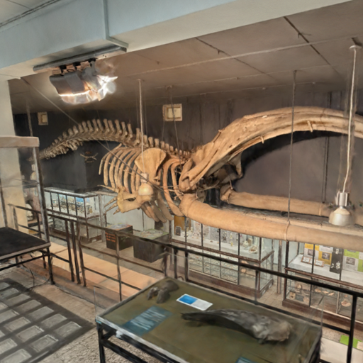
This is a Gaussian splatting dataset of the Museum of Zoology, maintained by the Catholic University of Leuven. The museum houses a collection of 5000 animals and skeletons, among which the skeleton of a bowhead whale (Balaena mysticetus) hanging from the ceiling. It was captured with permission of the university.
To load your own Gaussian splatting dataset in LuciadCPillar, see the Data Formats sample > Connect to service > OGC 3D Tiles.
Navigation
- Use the arrow keys or W/A/S/D to move horizontally, and Q/E to move down and up.
- Drag with the right mouse button to turn the camera.
- Hold Shift to move faster, or Space to move slower.
- On a touch screen, one finger turns the camera in place, two fingers pan, and pinching zooms.
- Select a point of interest in the Locations panel to fly towards it.
3D Data
Use Ogc3DTilesModelDecoder to create an ITileSet3DModel and use
TileSet3DLayer to create a layer for it. Pass a GaussianSplatsStyle to the layer builder to
decide how the splats are painted. This works for any OGC 3D Tiles tile set that contains SPZ, or glTF with SPZ
payloads.
Gaussian splatting data is often not georeferenced: the model then has a Cartesian reference and carries no
information about where on Earth it belongs. This sample recognizes that case and hands the model a
GeoLocation, which places it at a chosen location on the globe.
Gaussian Splat Settings
The Quality preset in the Options panel of the side bar, from Low to Ultra, balances
visual fidelity against rendering performance. Each preset combines a ResolutionScale, an OpacityCutoff and a
HighPrecisionColors setting on the GaussianSplatsStyle of the splat layer, together with a
quality factor on the layer itself, which decides how much detail the tile set loads.
The style keeps EnableDepth on, so the splats are taken into account when querying the depth at a pixel
and they can occlude other data such as meshes, point clouds and features. Querying the depth is also what lets the
navigation act on the splats themselves.
Labels desktop_csharp_sample_labels
This sample demonstrates how to use the label API and how to customize how the labels are displayed.
It has a map with states, rivers and cities data. Labels are decluttered to prevent label overlap and to avoid overlap with the view bounds.
Cities are filtered based on their population and become visible when you zoom in. The city labels contain more information when a city is selected and the used font size is derived from the population of the city. When a city's label can not be placed next to the city, a line (called pin) is drawn from the city location to its label. City labels are configured with a priority such that the labels of larger cities are shown in favor of labels of smaller cities when there is no room to display all labels.
Rivers only appear when the map is zoomed in enough and their labels are oriented based the on the river's direction.
States have labels which are positioned inside the state area. The state labels have lower priorities than city labels.
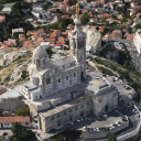
OGC 3D Tiles desktop_csharp_sample_ogc3dtiles
This sample shows how to load and visualize OGC 3D tiles meshes and point cloud data on the map. It also shows you how to style meshes and point clouds with expressions. The map supports both 3D and 2D projections.
Features
3D Data
Use Ogc3DTilesModelDecoder to create an ITileSet3DModel and use
TileSet3DLayer to create a layer for it. You can load 3D tileset data on 2D and 3D maps.
Graphics Effects
The Effects Settings tool shows the graphics effects that can be applied on a 3D scene:
- Eye-dome lighting (Depth Perception).
- Ambient occlusion (Ambient Light).
Expression based styling
TileSet3DLayer allows to set a PointCloudStyle that defines the expression based styles
for the point cloud data. This is demonstrated for the LIDAR layer that contains railways station point cloud data.
There are three types of expressions:
- The
colorExpressionproperty defines colors for point. By default colors are defined in the tile data. If no color is defined, LuciadCPillar paints them using a gray color. You can useStyleExpressionFactoryto define an expression that evaluates to a color value, e.g. based on attributes in the data. This sample shows how you can create a color expression based on the height of the points or on their intensity. - The
visibilityExpressionproperty is a filter that determines point cloud data visibility. You can useStyleExpressionFactoryto define an expression that evaluates to a boolean value. This sample shows how to filter points based on their height. - Point size expressions can be configured on the PointCloudStyle builder. You can use
StyleExpressionFactoryto define an expression that evaluates to a double value, that is interpreted as pixels or meters. This sample adds a slider that can be used to choose a point size.
Data
The Marseille 3D mesh data used in this sample was created by Airbus with Airbus Street Factory. The train station
lidar data was created by Flying-Cam for Altametris and SNCF Réseau. Both datasets are available as OGC 3D Tiles
services, hosted by our LuciadFusion server on https://sampleservices.luciad.com/.
You can use these services only for simple tests and demonstrations. You should not rely on either of them in any
way.
Panorama desktop_csharp_sample_panorama
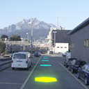
This sample illustrates how to use LuciadCPillar's Panorama API. A panorama is a photo with a very wide field of view, often even covering the full 360 degrees.
The map shows the Lucerne city mesh and a set of panorama locations along a track near the Lucerne train station. Each panorama location is visualized as a flat hexagon lying on the ground. Hovering a hexagon highlights it in green, clicking it selects it and highlights it in yellow.
Click a hexagon to fly the camera into that panorama and reveal its imagery. The map then switches to a look-around mode: drag to change the viewing direction and scroll to adjust the field of view. The camera eye stays pinned to the panorama location. When you are inside a panorama, click the "Leave Panorama" button at the top of the map to switch back to the 3D map.
In the sample code, you will find a controller and animations you can reuse and adapt in your own projects.
PanoramaController keeps the camera eye pinned while you look around, and
PanoramaViewer flies the camera into a panorama and cross-fades the imagery when you move from
one panorama to another. The usage of the actual Panorama API can be found in
Viewer/PanoramaViewer.cs and Model/PanoramaLocationModelFactory.cs.
The data in this sample is provided by Hexagon GeoCloud.
Parameterized Styling desktop_csharp_sample_parameterized_styling
This sample shows how to display time-based data and expression-based styling.
Data
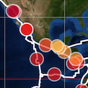
The sample shows an overview of world-wide earthquakes from 2000 to 2011, as well as the tectonic plates of the planet. Both are GeoPackage files that are styled and filtered using properties from the files.
The dot size indicates the earthquake's magnitude : larger dots for stronger quakes.
The dot color indicates the earthquake's depth : quakes near the surface are red, deeper quakes are yellow to blue.
The color of the fault lines depends on the type of fault lines: light yellow lines indicate subduction
fault lines, while light blue lines indicate non-subduction fault lines.
When the earthquakes layer is selected in the layer tree, two sliders can be used to apply filtering on the
earthquake data. One is a time range filter, and the other filters based on the magnitude of the earthquakes.
The filtering is done via the visibility expression on the IconsDrawCommand, by using parameter
expressions.
The sample also show countries with a fill color that is derived from the population property of each country. Country borders are highlighted in black.
When the country layer is selected in the layer tree, one slider can be used to filter countries based on a population range.
The filtering is done via the visibility of the GeometriesDrawCommand, by using parameter expressions.
Parameterized styling
With an IParameterizedFeaturePainter you can style your data using expressions that can be created
with the StyleExpressionFactory. In this sample, this is demonstrated in both the
EarthQuakePainter and the CountryPaintercode>. By using expressions, you can achieve
similar visualization as a traditional IFeaturePainter but also make use of fast filtering and dynamic
styling.
Controller customization for selection desktop_csharp_sample_selection
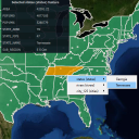
This sample demonstrates how to create and use the controller API in order to select the right feature.
It has a map with states, rivers and cities data:
- When a feature is selected, feature properties are listed in a panel.
- While pressing Alt and clicking on one or several features, a context menu allows the user to select which feature to select/unselect.
- While pressing Shift and dragging the mouse, a rectangle is drawn and selects/unselects all features under it. This feature is only available with a 2D map.
Military symbology desktop_csharp_sample_symbology
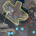
This sample demonstrates the modeling, visualization, editing and creation of military icons and tactical graphics, for the MS2525 and APP6 standards.
The sample starts up with a few tactical graphics and icons already initialized on a map. To create a new symbol, type its name in the toolbar widget, pick the desired symbol from the list and click on the map to start creation.
The sample also includes an MGRS grid, displaying labeled grid lines with increasing detail as the view zooms in. An overview label in the top-right corner of the window provides positional context with the currently visible MGRS grid zone and, if zoomed in enough, 100 km square.
Line-of-sight desktop_csharp_sample_terrain_analysis
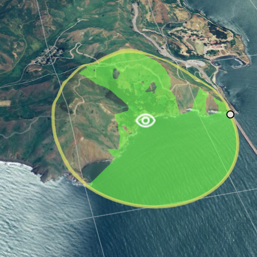
This sample demonstrates how LuciadCPillar supports visualizing and editing line-of-sight coverage data.
- An Elevation layer visualized as 3D terrain and used for the line-of-sight coverage computation
- An Editing layer allowing to create and edit new observers
- A Line of Sight layer allowing to visualize the line-of-sight coverage data
The first button at the top left of the toolbar allows to create new observers. Existing observers can be selected, moved and resized, using the handles. Selected observers can be removed either by pressing the backspace or delete key, or by clicking the second button on the toolbar. Selected observers can be deselected by pressing the escape key. Added observers are positioned 10 meters above the terrain. In this sample, the line-of-sight coverage is limited to a radius of at most 60 kilometers.
Tracks desktop_csharp_sample_tracks
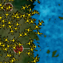
This sample demonstrates working with dynamic data on the map as well as using density styling to create heat maps.
It starts in normal mode, with airplanes flying between cities. The rendering of the dynamic data changes when you zoom in, including pin style labels.
Dynamic mode shows a heat map of the airplanes, made by applying density painting to icons. Static mode has density painting applied to lines between cities, with more trajectories between two cities resulting in brighter lines.
Video Projection desktop_csharp_sample_video_projection
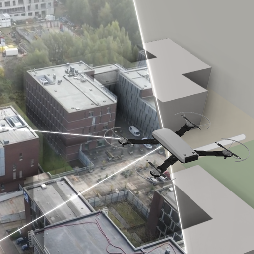
This sample demonstrates how to use the Projected Image API, which can be used to project and visualize drone or security camera footage.
Click the video preview in the lower-left corner, or press the space bar, to pause or resume playback. Each video frame is projected onto the map using the corresponding flight data.
The map's camera follows the drone by default. You can toggle this behavior with the 'Lock camera' switch at the top of the map.
The background layer using MbTiles is based on map data from OpenStreetMap.
The Mapbox style file referenced within the 'Connect to MBTiles' license file is available at: https://sampledata.luciad.com/data/mbtiles/osm_styles/osm-bright/LICENSE.md.
Using the CPillar map in WinForms desktop_csharp_sample_winforms
This sample demonstrates the integration of the map using a Windows Forms App.
It has a map with bluemarble as background data.
There is a menu action which allows to add some geometries.

Using the CPillar map in WinUI 3 desktop_csharp_sample_winui3
This sample demonstrates the integration of the map into the WinUI 3 UI framework.
It has a map with a bluemarble background.

Using the CPillar map in WPF desktop_csharp_sample_wpf
This sample demonstrates the integration of the map into the WPF UI framework.
It has a map with a bluemarble background.
There is a menu action which allows to open supported files.
Camera android_java_kotlin_camera
Demonstrates the camera API with an orbit camera controller that orbits a centered point of interest.
Use the toggle button on the map to switch between the Orbit camera controller and the default controller.
The Orbit camera consists of a camera orbiting around a cube, keeping that point of interest in the center of the view. This controller uses the Map.IRendererCallback API to modify the camera on each repaint of the Map.
Complex Strokes android_java_kotlin_complexstrokes
Demonstrates the Complex Stroke API to stroke lines with complex patterns and add decorations at specific locations along the line.
For example, you could draw a line with a sawtooth pattern and decorate it with arrows at the start and the end of the line.
In the sample you will see various shapes and lines that are stroked using the Complex Stroke API, grouped into themes. You can see how the shape is styled in the sample code.
You can select an object to start editing it. Notice how the patterns dynamically follow the shape while editing.
The Cookbook Theme is intended for developers. You can experiment with complex stroke line styles by changing sample snippets, or by creating new complex stroke styles and visualizing the results. You can also edit shapes to check how the complex stroke line style is drawn over the vertices of a shape.
Data Formats android_java_kotlin_dataformats
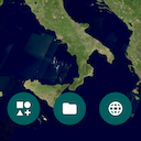
Demonstrates loading different data formats on the map.
You can open files from the device, connect to web services, or add a vector model with default styling.
It starts with a map that has a Blue Marble background layer. There are buttons that allow you to:
- Open supported files stored on the mobile device's SD card
- Connect to a web service (WMS, WMTS, WFS, OGC 3D tiles, HSPC, HERE Maps, MBTiles, and LTS)
- Add a basic vector model showing several supported geometries using default styling.
There is a layer control allowing you to change the visibility of layers and to re-order them.
The Mapbox style file referenced within the 'Connect to MBTiles' license file is available at: https://sampledata.luciad.com/data/mbtiles/osm_styles/osm-bright/LICENSE.md. The default MBTiles dataset of Belgium is provided by OpenStreetMap.
Editing and creation android_java_kotlin_editing
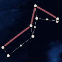
Demonstrates creating and editing features using the editing API.
You can create polylines, polyline rings and bezier curves, then select a feature to reshape or delete it with its edit handles.
Instructions
Creating features
Features can be added to the map using the buttons.
Polylines, polyline rings and bezier curves can be created using a click mode. Polylines and polyline rings can also be created with a free hand mode. In tap mode, use double-tap or touch long press to end creation. For bezier curves the creation ends when the last point is placed. In free hand mode, the feature is finalized as soon as the drag gesture ends.
Editing features
Touch a feature to select it and show its edit handles. Drag the edit handles around to change the geometry. Points can be removed from a polyline or polyline ring using long press.
Tutorial layers
This sample also includes a couple of layers that are used in tutorials in the product documentation:- Tutorial 1: the tutorial on how to customize an existing handles provider
- Tutorial 2: the tutorial on how to add extra handles to an existing handles provider
- Tutorial 3: the tutorial on how to create a custom handles provider
Feature Styling android_java_kotlin_feature_styling
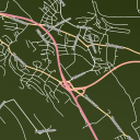
Demonstrates loading and styling of feature data, shown with roads whose type and styling depend on the map scale and their selected state.
It has a map with roads data:
- The type of roads that are loaded are configured per map scale.
- The styling of the data depends on their type, selected state and on the map scale.
Gaussian splats android_java_kotlin_gaussiansplats
This sample shows how to load and visualize 3D Gaussian splatting data on the map, and how to inspect it from close
by. The data is delivered as an OGC 3D Tiles service and painted with a GaussianSplatsStyle, which
can be used to configure visual fidelity and performance.
Features
Dataset
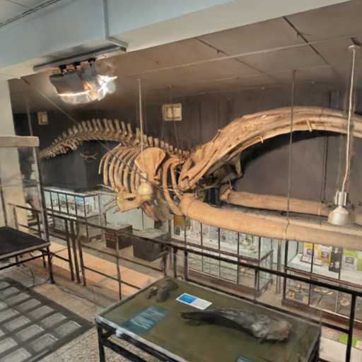
This is a Gaussian splatting dataset of the Museum of Zoology, maintained by the Catholic University of Leuven. The museum houses a collection of 5000 animals and skeletons, among which the skeleton of a bowhead whale (Balaena mysticetus) hanging from the ceiling. It was captured with permission of the university.
To load your own Gaussian splatting dataset in LuciadCPillar, see the Data Formats sample > Connect to service > OGC 3D Tiles.
Navigation
- Drag with one finger to turn the camera.
- Drag with two fingers to move the camera.
- Pinch two fingers to zoom.
- Double tap to move towards a point.
- Use the thumbstick at the bottom left to fly through the museum, and the arrow buttons next to it to go up and down.
- Select a point of interest in the Locations panel to fly towards it.
3D Data
Use Ogc3DTilesModelDecoder to create an ITileSet3DModel and use
TileSet3DLayer to create a layer for it. Pass a GaussianSplatsStyle to the layer builder to
decide how the splats are painted. This works for any OGC 3D Tiles tile set that contains SPZ, or glTF with SPZ
payloads.
Gaussian splatting data is often not georeferenced: the model then has a Cartesian reference and carries no
information about where on Earth it belongs. This sample recognizes that case and hands the model a
GeoLocation, which places it at a chosen location on the globe.
Gaussian Splat Settings
The Quality presets, from Low to Ultra, balance visual fidelity against rendering performance.
Each preset combines a resolutionScale, an opacityCutoff and a
highPrecisionColors setting on the GaussianSplatsStyle of the splat layer, together with a
quality factor on the layer itself, which decides how much detail the tile set loads.
The style keeps enableDepth on, so the splats are taken into account when querying the depth at a pixel
and they can occlude other data such as meshes, point clouds and features. Querying the depth is also what lets the
navigation act on the splats themselves.
Labels android_java_kotlin_labels
Demonstrates the label API and customizing how labels are displayed, using a map with states, rivers and cities.
Labels are decluttered to prevent label overlap and to avoid overlap with the view bounds.
Cities are filtered based on their population and become visible when you zoom in. The city labels contain more information when a city is selected and the used font size is derived from the population of the city. When a city's label can not be placed next to the city, a line (called pin) is drawn from the city location to its label. City labels are configured with a priority such that the labels of larger cities are shown in favor of labels of smaller cities when there is no room to display all labels.
Rivers only appear when the map is zoomed in enough and their labels are oriented based the on the river's direction.
States have labels which are positioned inside the state area. The state labels have lower priorities than city labels.
OGC 3D Tiles android_java_kotlin_ogc3dtiles
Demonstrates loading and visualizing OGC 3D Tiles meshes and point cloud data on the map, and styling meshes and point clouds with expressions.
Features
3D Data
Use Ogc3DTilesModelDecoder to create an ITileSet3DModel and use
TileSet3DLayer to create a layer for it. You can load 3D tileset data on 2D and 3D maps.
Graphics Effects
The Effects Settings (button with paint brush icon) shows the graphics effects that can be applied on a 3D scene:
- Eye-dome lighting (Depth Perception).
- Ambient occlusion (Ambient Light).
Expression based styling
TileSet3DLayer allows to set a PointCloudStyle that defines the expression based styles
for the point cloud data. This is demonstrated for the LIDAR layer that contains railways station point cloud data.
The style settings can be accessed via the button with the gear icon at the bottom of the screen. There are
three types of expressions:
- The
colorExpressionproperty defines colors for points. By default colors are defined in the tile data. If no color is defined, LuciadCPillar paints them using a gray color. You can useStyleExpressionFactoryto define an expression that evaluates to a color value, e.g. based on attributes in the data. This sample shows how you can create a color expression based on the height of the points or on their intensity. - The
visibilityExpressionproperty is a filter that determines point cloud data visibility. You can useStyleExpressionFactoryto define an expression that evaluates to a boolean value. This sample shows how to filter points based on their height. - Point size expressions can be configured on the
PointCloudStylebuilder. You can useStyleExpressionFactoryto define an expression that evaluates to a double value that is interpreted as pixels or meters. This sample adds a slider that can be used to choose a point size.
Data
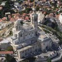
The Marseille 3D mesh data used in this sample was created by Airbus with Airbus Street Factory. The train station lidar data was created by Flying-Cam for Altametris and SNCF Réseau.
Both datasets are available as OGC 3D Tiles
services, hosted by our LuciadFusion server on https://sampleservices.luciad.com/.
You can use these services only for simple tests and demonstrations. You should not rely on either of them in any
way.
Panorama android_java_kotlin_panorama
This sample illustrates how to use LuciadCPillar's Panorama API. A panorama is a photo with a very wide field of view, often even covering the full 360 degrees.
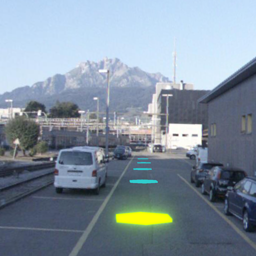
The map shows the Lucerne city mesh and a set of panorama locations along a track near the Lucerne train station. Each panorama location is visualized as a flat hexagon lying on the ground. The selected panorama is highlighted in yellow.
Tap a hexagon to fly the camera into that panorama and reveal its imagery. The map then switches to a look-around mode: drag to change the viewing direction and pinch to adjust the field of view. The camera eye stays pinned to the panorama location. When you are inside a panorama, tap the "Leave Panorama" button at the top of the map to switch back to the 3D map.
In the sample code, you will find a controller and animations you can reuse and adapt in your own projects.
PanoramaController keeps the camera eye pinned while you look around, and
PanoramaViewer flies the camera into a panorama and cross-fades the imagery when you move from
one panorama to another. The usage of the actual Panorama API can be found in PanoramaViewer.kt
and PanoramaModelFactory.kt.
The data in this sample is provided by Hexagon GeoCloud.
Parameterized Styling android_java_kotlin_parameterized_styling
Demonstrates displaying time based data and expression based styling, applied to world-wide earthquakes and tectonic plates.
Data
The sample shows an overview of world-wide earthquakes from 2000 to 2011, as well as the tectonic plates of the planet. Both are GeoPackage files that are styled and filtered using properties from the files.
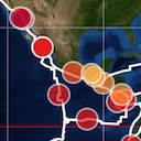
The dot size indicates the earthquake's magnitude : larger dots for stronger quakes.
The dot color indicates the earthquake's depth : quakes near the surface are red, deeper quakes are yellow to blue.
The color of the fault lines depends on the type of fault lines: light yellow lines indicate subduction
fault lines, while light blue lines indicate non-subduction fault lines.
When the earthquakes layer is selected in the layer tree, two sliders can be used to apply filtering on the
earthquake data. One is a time range filter, and the other filters based on the magnitude of the earthquakes.
The filtering is done via the visibility expression on the IconsDrawCommand, by using parameter
expressions.
The sample also show countries with a fill color that is derived from the population property of each country. Country borders are highlighted in black.
When the country layer is selected in the layer tree, one slider can be used to filter countries based on a population range.
The filtering is done via the visibility of the GeometriesDrawCommand, by using parameter expressions.
Parameterized styling
With an IParameterizedFeaturePainter you can style your data using expressions that can be created
with the StyleExpressionFactory. In this sample, this is demonstrated in both the
EarthQuakePainter and the CountryPaintercode>. By using expressions, you can achieve
similar visualization as a traditional IFeaturePainter but also make use of fast filtering and dynamic
styling.
Military Symbology android_java_kotlin_symbology
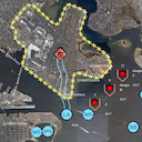
Demonstrates the modeling, visualization, editing and creation of military icons and tactical graphics, for the MS2525 and APP6 standards.
The sample starts up with a few tactical graphics and icons already initialized on a map. Different symbology standards can be selected using the theme button on the top right of the screen.
To create new symbols, tap the add (+) button. You can search for the desired symbol or pick a symbol from the recently used list.
To edit a symbol you must first select it. You can then change the military symbol's geometry by manipulating the handles on the map. If you want to change other symbol properties, tap on the edit button at the bottom of the screen. You can delete the selected symbol by tapping on the trashcan icon.
The sample also includes an MGRS grid, displaying labeled grid lines with increasing detail as the view zooms in. An overview label centered at the top of the map provides positional context with the currently visible MGRS grid zone and, if zoomed in enough, 100 km square.
Line-of-sight android_java_kotlin_terrain_analysis
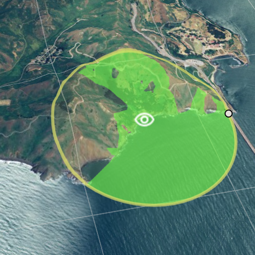
Demonstrates visualizing and editing line-of-sight coverage data over 3D terrain.
- An Elevation layer visualized as 3D terrain and used for the line-of-sight coverage computation
- An Editing layer allowing to create and edit new observers
- A Line of Sight layer allowing to visualize the line-of-sight coverage data
Buttons at the bottom allow the creation of new observers and deletion of selected observers. Existing observer can be selected, moved and resized, using the point handles. Added observers are positioned 10 meters above the terrain. In this sample, the line-of-sight coverage is limited to a radius of at most 60 kilometers.
Tracks android_java_kotlin_tracks
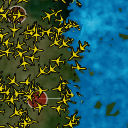
Demonstrates working with dynamic data on the map as well as density styling to create heat maps.
It starts in normal mode, with airplanes flying between cities. The rendering of the dynamic data changes when you zoom in, including pin style labels.
Dynamic mode shows a heat map of the airplanes, made by applying density painting to icons. Static mode has density painting applied to lines between cities, with more trajectories between two cities resulting in brighter lines.
Video Projection android_java_kotlin_video_projection
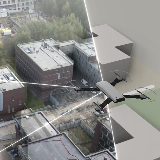
Demonstrates the projected image API to project and visualize drone or security camera footage.
Use the video panel controls on the left to control playback. Each video frame is projected onto the map using the corresponding flight data.
The map's camera follows the drone by default. You can toggle this behavior with the camera lock button at the top.
The background layer using MbTiles is based on map data from OpenStreetMap.
The Mapbox style file referenced within the 'Connect to MBTiles' license file is available at: https://sampledata.luciad.com/data/mbtiles/osm_styles/osm-bright/LICENSE.md.